Saving Lives with Augmented Reality Training
- Interaction, UX Design
- Unity Implementation
- Animation
- Sound Design
Client
U.S. Army
Role
User experiences and user interface designer
Tools
Pencil and paper, Figma, Adobe XD, Miro, After Effects, Unity, and Adobe Premiere
The Problem
A lack of easy to reproduce and immersive training in the Army’s Tactical Combat Casualty Care (TCCC) program creates a barrier to effective, realistic training.
The Solution
To create an Augmented Reality solution in the Hololens and Samsung Galaxy tablet that provided two critical features:
- Stressors similar to a real-world battlefield to increase cognitive load.
- Haptic training that allowed trainees to practice their psychomotor skills while being immersed.
My Process
User Observation
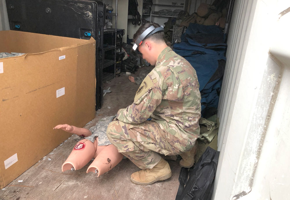
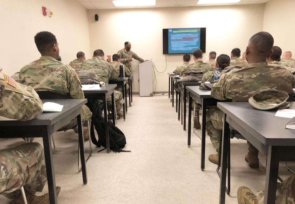
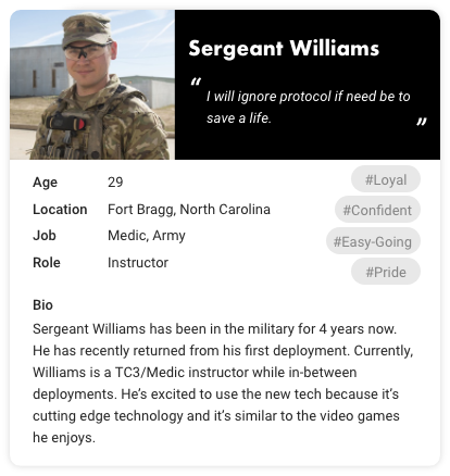
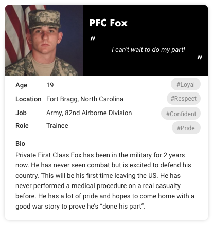
My process included several design iterations over a couple of years with a team of developers, 3-D artists, technical artists, and researchers. After reviewing the requirements, my first step was to meet with the users at Fort Bragg. At Fort Bragg, we were able to observe the trainee’s current training and create a task analysis based on what we saw.
From our observations, I created two separate personas for the users of our system – a young trainee and an instructor. These personas were vital to our journey mapping session and to user experience decisions.
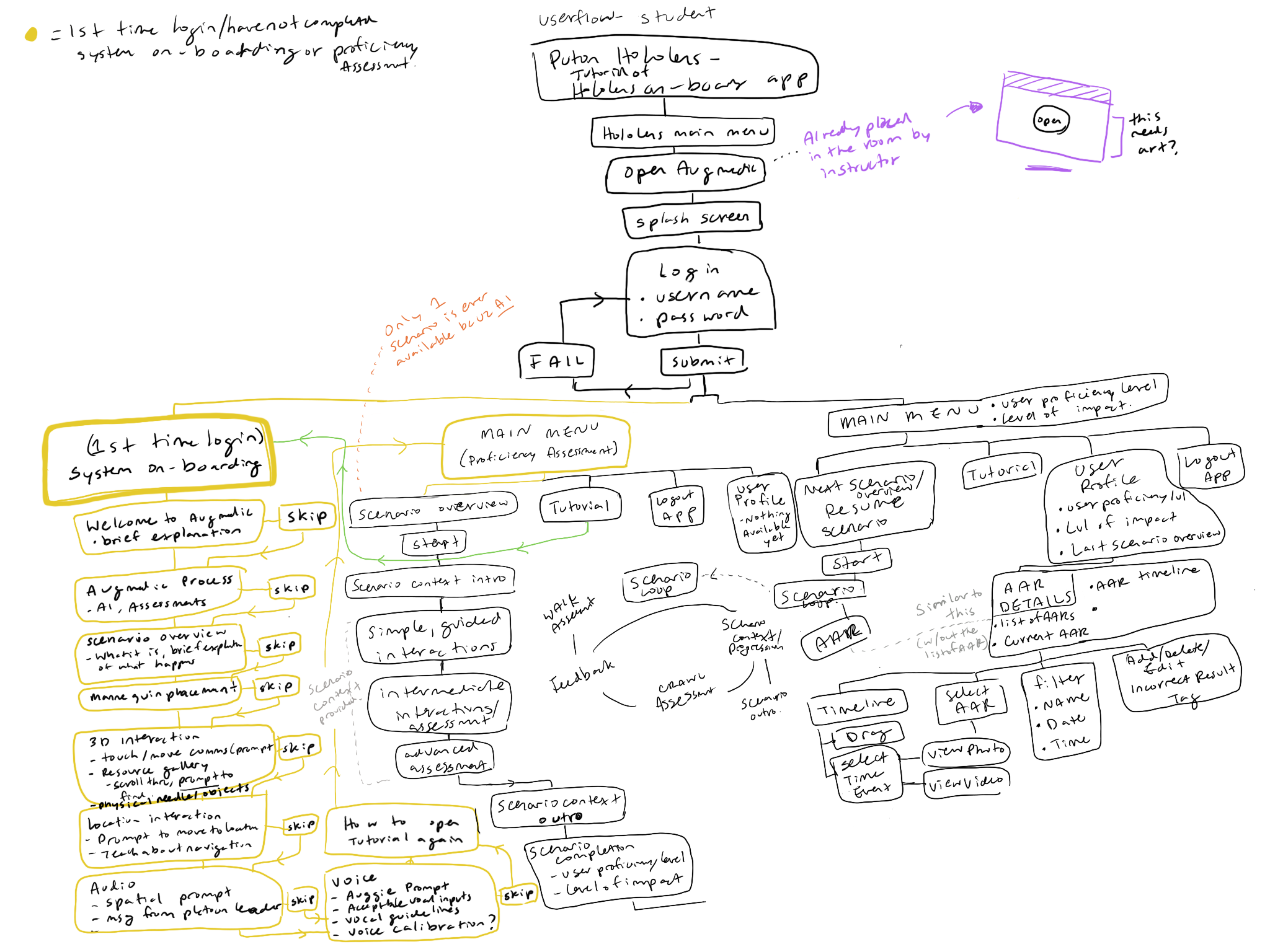
Userflows
After collecting user data we identified additional requirements and opportunities.. The next step for my process was to create a userflow. I started with a sketch and ended with a fleshed-out user flow.
My goal with the flow was to identify all areas of the system that the user would see or interact with. I wanted to identify every error or new window that the user might encounter.
Reviewing the userflow with the team really helped everyone to understand all of the different branches that we would need to account for and it helped to descope any effort that might be too much work.
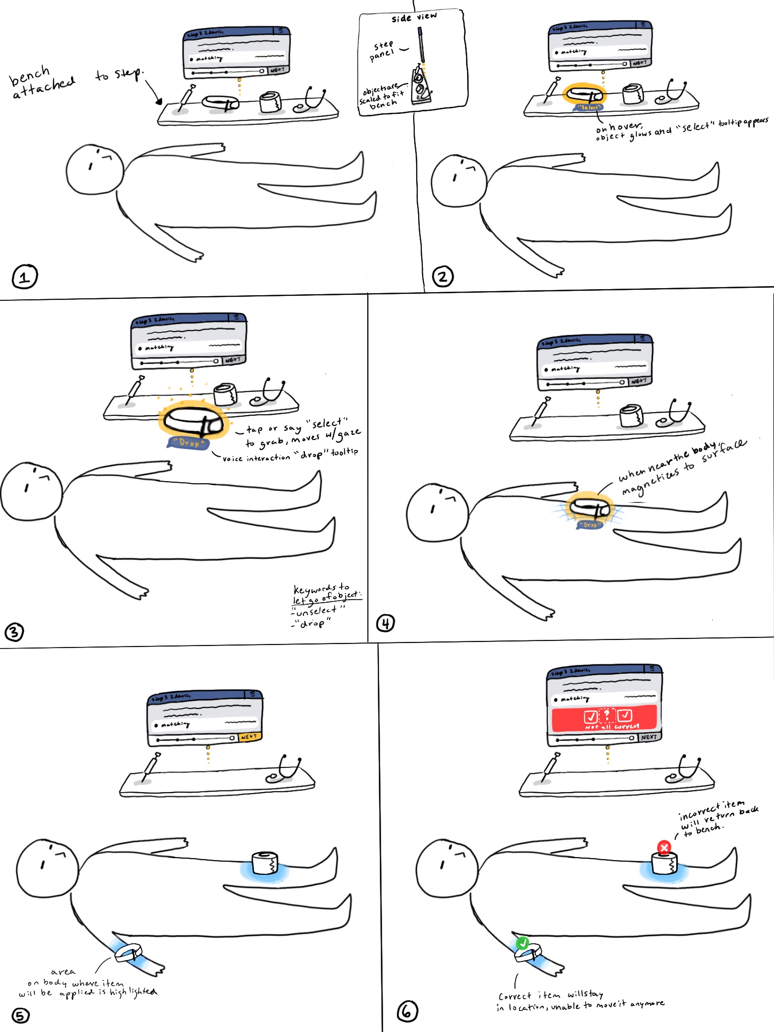
Interaction Prototypes
Designing for AR interactions presented interesting challenges. Our solution was to create VR prototypes that allowed us to quickly iterate and test without having to commit to a lengthy development process to test designs.
Prototypes evolved from sketches, wireframes, and high fidelity designs. I would then work with a technical artist who could quickly create a prototype in Unity of the interaction. This prototype process allowed for effective, rapid iteration.
Occasionally, I would test UI on my phone with both the Torch and Adobe Aero apps.
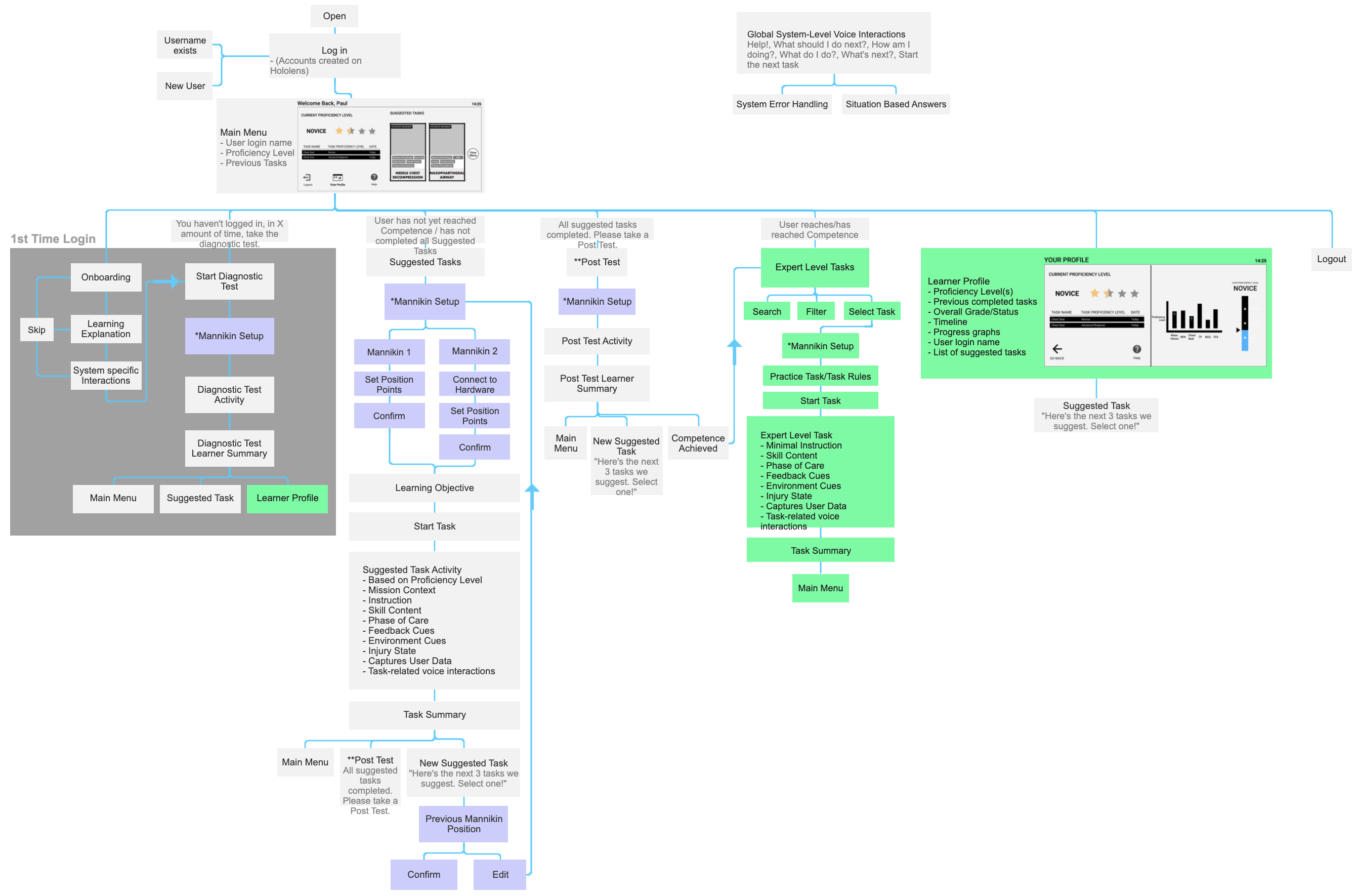
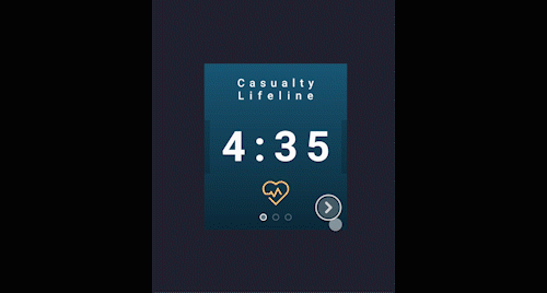
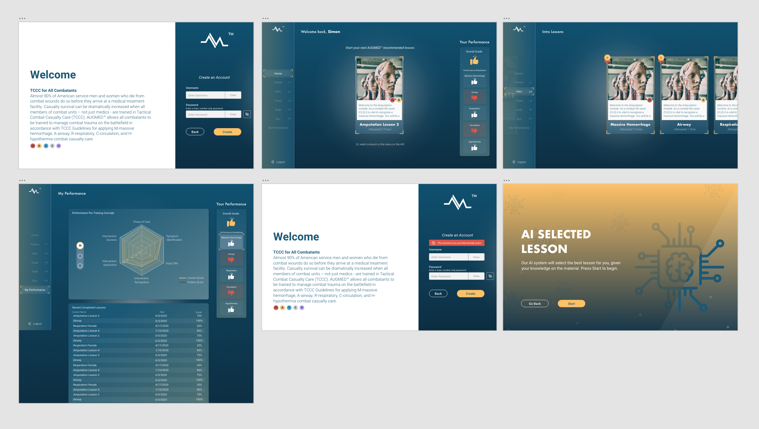
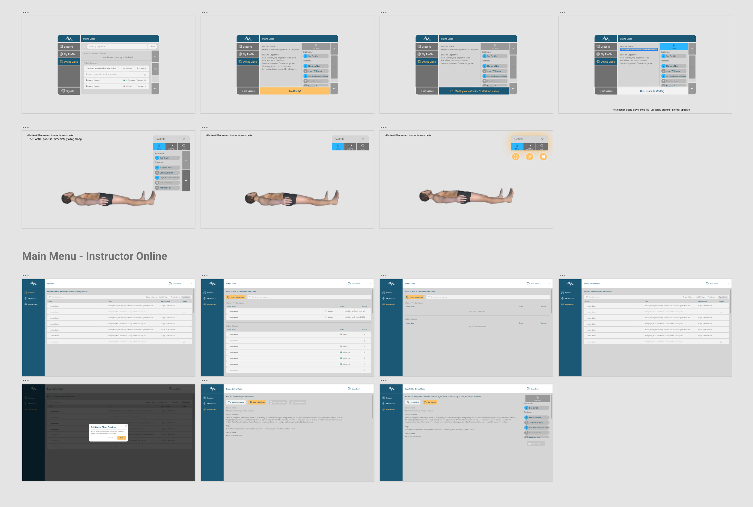
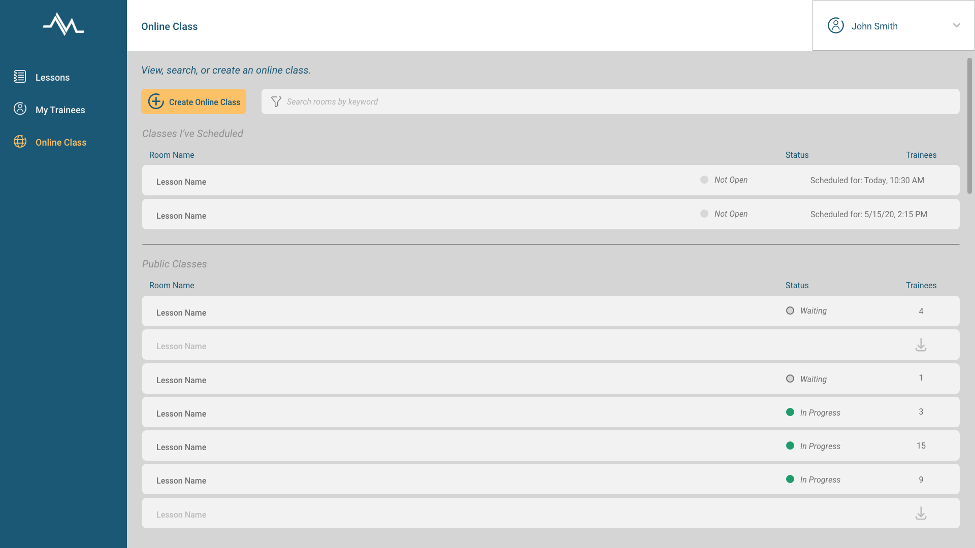
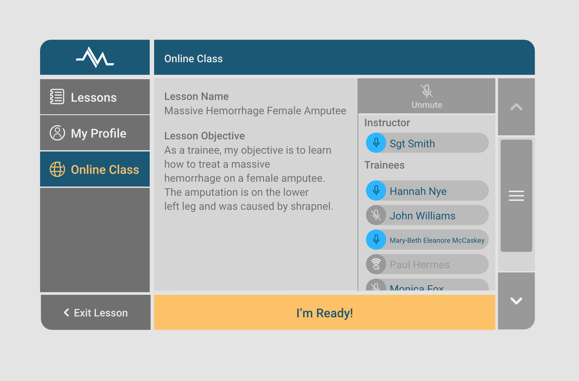
High Fidelity Designs
After testing prototypes, I was able to determine the best interactions and create high fidelity designs to pass on to the developers. These were designs for the Hololens and for a Samsung Galaxy tablet. The system design went through many iterations over 3 years and I showcase just a handful of my favorite below.
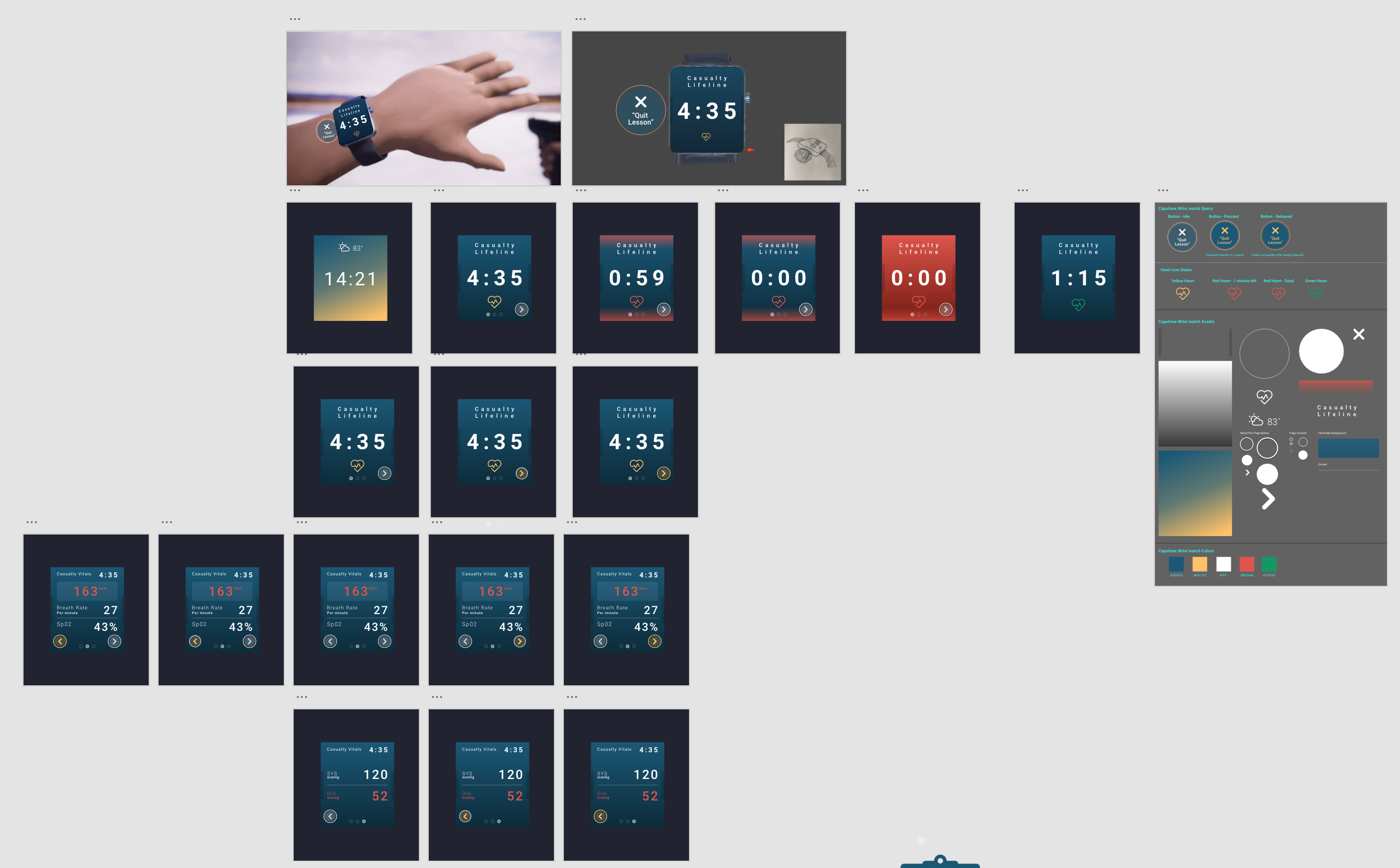
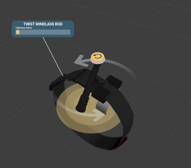
Augmented Reality Watch
Tablet Menu
Remote Collaboration
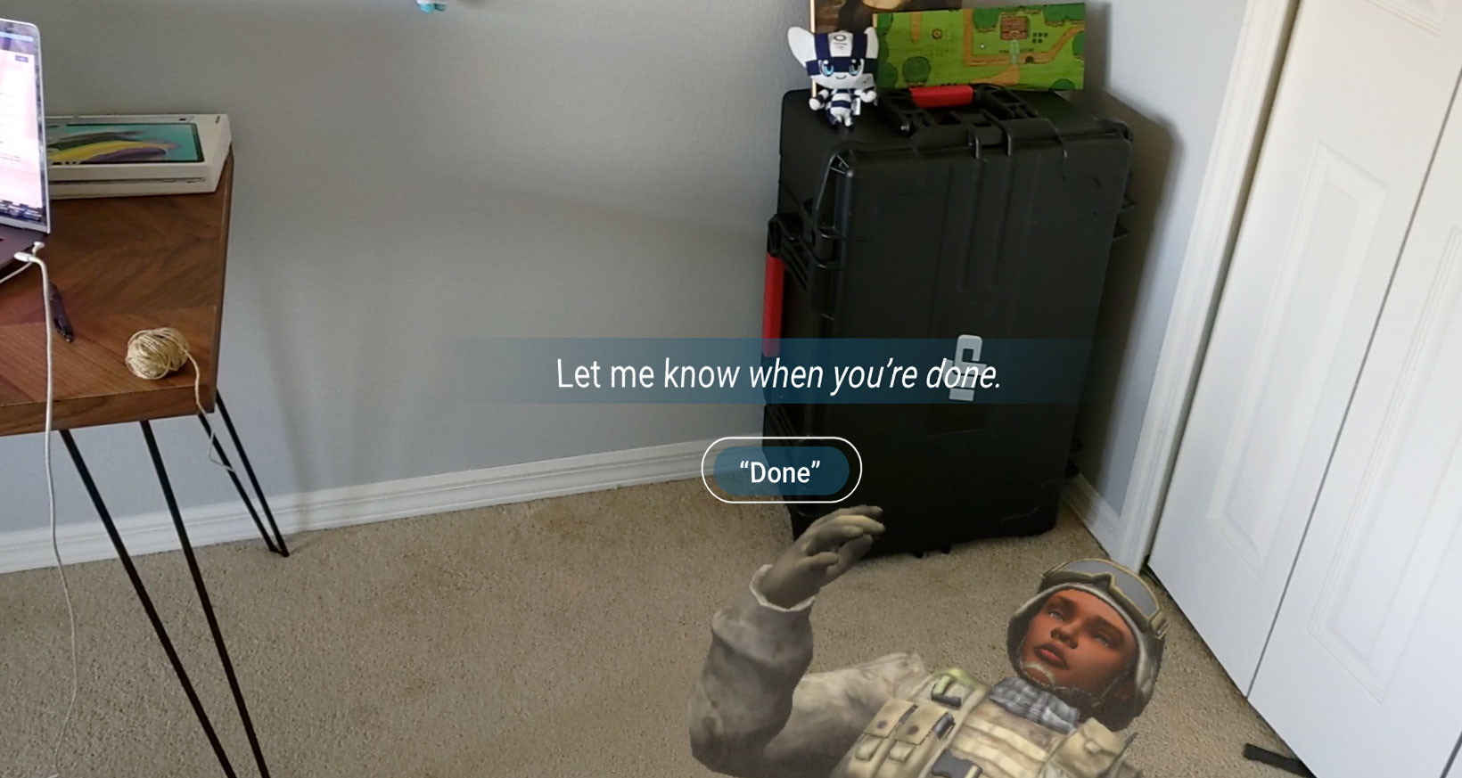
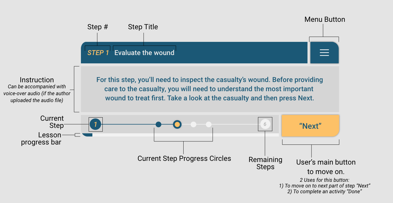
Lesson Instruction
What We Delivered
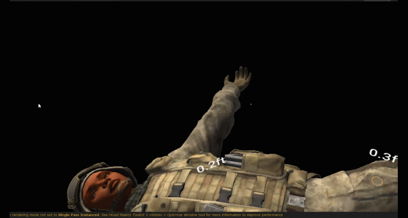
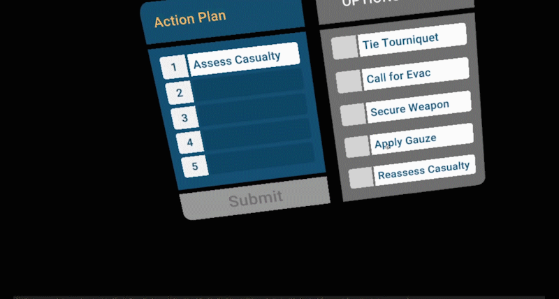
Our final deliverable included an Augmented Reality system on the Hololens 2 and Samsung Galaxy tablet that provided trainees with a customized lesson plan for their TCCC training. It provided lessons that worked with mannikins outfitted with pressure sensors and realistic skin tissue.
I really enjoyed working on this project because it allowed me to help create a system that could potentially save lives. Also, it was exciting to have an opportunity to work on an augmented reality project that I had the privilege to see grow and evolve over three years.
Here’s a look at it in action:
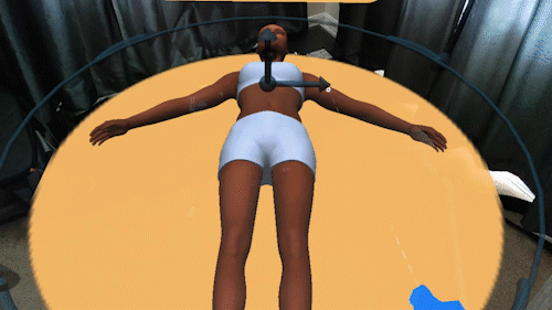
Patient placement – This interaction allowed the user to place and align
the virtual patient with the physical manikin.
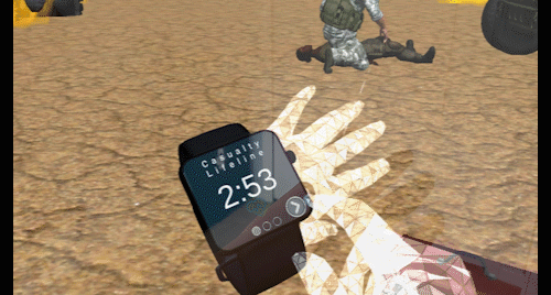
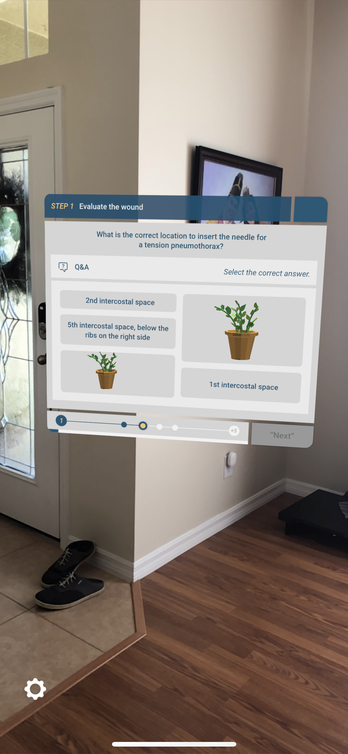
Virtual watch and Q&A UI – The watch provided information about the
casualty in an interaction that was natural and the Q&A UI is
presented in a minimal, non-evasive way.